Tuesday, March 19, 2019

Focusing attention


This is a shot of a street in New Orleans where people are out for a Sunday morning stroll.  I took this with an Olympus PEN E-P3 and 17mm/35mm lens.  It's just a typical street photo, nothing special, but it captures a slice of life in the Big Easy.

Well, the slice of life where people are not staggering around half-naked and throwing up everywhere, anyway.

I wanted to point out a couple of things in the composition that make this photo work (to whatever extent you think it works, that is).

NoLa is a colorful place, which is why I used the color version of the photo at the top of the post.  But to discuss composition, I want to switch to black and white so as not to be distracted by the colors.


So, here's the thing about this composition.  The leading lines are taking your eye down the street, like so:


BUT, you have the couple pushing the stroller in the foreground on the left of the frame, and they are interesting.  They are moving against the flow, so to speak.  They are walking toward the viewer, where everybody else is walking away.  Also, they are fighting against the leading lines in the photo. They are swimming upstream.

Look at the photo for a minute (one of the ones without my red markups) and think about where your eye is going.  Hopefully, you eye is moving around the photo, but there should be an axis where it stays most of the time.  I think it should be like this:


Your eye can't decide which is more interesting, the couple in the foreground that you can see clearly, or what is going on down the street, which is sort of at the limit of your ability to discern details.

And that indecision, that back and forth motion of the eye, that's what provides the tension and hopefully the interest in the photo that helps you feel the situation.  And, just to help it out a little we'll darken the upper left and lower right corners of the frame to force your eye more into that line of tension, like so:

Monday, March 18, 2019

Don't worry too much about sharpness


Henri Cartier-Bresson once said, "Sharpness is a bourgeois concept."

I don't think this is universally true, but it's certainly a valid concept for a host of typical photography subjects.

Think about paintings, for example.  While there are a few artists who do hyper-realistic paintings that are essentially indistinguishable from photographs, in general the thing that makes a painting so good is that it is a representation of reality, full of imperfections that taken as a whole communicate a feeling to the viewer.

That's important to keep in mind:  A photo, like a painting, consists of an arrangement of dots on a two-dimensional medium, and the 'image' is formed in your head.

Now, if you are shooting landscapes that are intended to be printed large for sale, you probably need a sharp image.  In some cases, portraits also need some sharpness, depending on exactly what you are trying to do. Plus, unless you are doing environmental portraits, the trend is to make only the eyes razor sharp, and let depth of field limit the sharpness of other parts of the face.

Just for the sake of documenting how a child looked in the past, and how they changed as they grew up, for example, you can take hundreds of photos and many of them will be sharp.  But for storytelling purposes, sharpness is not necessary.


This is a photo of my granddaughter.  This kid has more energy than any child I have ever seen.  As soon as she learned to walk, she was constantly in motion.  In fact, when she came to visit me, the first words out of her mouth would always be "Let's Run!", and off she would go, expecting me to chase her.  I wanted to take photos of her, but I could never catch her still enough to even get a photo.  This one, above, was pretty much my most successful attempt over a period of TWO YEARS.  And as you can clearly see, it's not sharp at all.  But I love it, because it completely represents her personality over those years.  She was happy, and in motion.  And here she is in a recent photo, playing with her sister.  Her games always involve running.


Remember, your photos tell a story and that story is about communicating inside the viewer's head.  Sharpness is not really required in most cases.


Friday, March 15, 2019

Looking for elements of composition


While strolling with my wife one evening, I came upon this scene.  At first, I was drawn to the repeated elements of the steps, and the placement of the couple.  I didn't want to be too obtrusive, so I just snapped the shot without taking too much time and moved on.  My thinking at the time was that the vertical composition would work with the steps going upward in the frame.  And while it was not a wonderful photo opportunity, I felt certain that something interesting was in there.  

So, I got back to do the post processing and at least straighten up the frame, etc.  But in the process I decided to crop out some extraneous dead space and such, so I switched to landscape orientation so I could emphasize the couple. 

And that's when a sort of magical thing happened.  I realized that there were additional compositional elements in the photo that I had, frankly, not noticed at first.  Here is my crop:


First of all, I like this much better because the crop has pulled the foreground couple closer and made them more of a focus.  But by doing that I noticed a happy accident in the background.


There are actually three couples arranged in a triangle on the right side of the frame.  Ok, I know my red markup looks more like Mickey Mouse head, but I was just pointing out the location of the three couples.  The steps work to direct the eye upward to the right, toward the couples.  So that was cool.  But from a balance standpoint, something else was there.


This guy.  Standing off the the left.  In this crop he is prominent enough to actually become a compositional element in two ways.  First, he works in opposition to the foreground couple on the right.  Imagine a balance with the fulcrum near the center of the frame, near the couple, and the guy off on the long arm of the balance.  They are 'heavy' on the lower right, but he is trying to balance the composition by being separated at a distance.  The long lever arm leaves the impression that he could weigh down the long arm and balance out the weight of the couple.

So, whatever, right?  It's kinda thin, I admit.  But still the balance of weights in a composition is important and provides another element of subliminal experience in the viewer.  But here is the most important compositional element in the storytelling sense:


On the right side of the frame are three couples, and on the left side is a single man.  Plus, there is something about the way he is standing there that also creates tension.  It's a place where couples go to stroll and sit and look at the streets of Rome, but he has no partner.  At a glance, you might not notice, but if you look at the photo for a minute, you begin to think about the back story possibilities, why is he alone, etc.  At least, that's what I do.


Tuesday, March 12, 2019

Saving a shot


Often you will find yourself in situations with bad lighting.  Noonday sun, for example, that over exposes everything and simultaneously creates impenetrable shadows.  Or night time scenes (which we will focus on specifically later).  Or building interiors.  Or dusk.  There are innumerable situations where your eye sees everything just fine, but the camera sensor, not so much.

But have heart, many of these situations are salvageable.  Take this shot for example.  It's a crop from a larger image, and although it is not in finished form, you can see possibilities.  But can you see the possibilities in the original image?


Hmmm.  It's a stretch.  This was an offhand street shot where the camera chose to meter on the sky, leaving everything else in almost total darkness.  Or so it seems.

But I have shot a lot with this camera (Olympus OMD EM5-II) and I know it has the ability to pull up useable images from the mud.  So when I looked at the viewfinder, I saw a nice sky and some illumination in the foreground, and I felt like I could save it.

The first thing I did was to adjust the exposure, which I could do pretty well since I shot the original in raw format.  Here is the result:


By adjusting the exposure in the foreground, I was able to save the sky and bring up details.

Next, I adjusted the crop.


That's pretty good.  Yeah, I know things are all angle-y, but she is pretty straight and because she is looking up to the right of the frame, you don't mind the tilt of the background so much.  Next, I brightened her up a little:

So, this seems ok, and maybe better than ok.  And I am thinking this is a keeper, but it does have some issues.  First of all, since it was getting dark, when I pulled up the exposure I pulled up a lot of noise with it.  At this size, you can't really see that, but if you blew up the image on the screen, it is obvious. Filtering out the noise softened the image so much that it was very noticeably smoothed, and the texture on the background structures was lost altogether.  So I scrapped that idea.

Instead, I used my patented trick for saving bad photos: IMTDT (I Meant To Do That).  I used this technique three ways, just to see what would happen.  Never be afraid to experiment with digital photos, just make sure you save your work early and often.

First, I altered the color grade and introduced MORE noise.


You probably don't notice the extra noise I introduced in this version, but on a larger scale it is definitely there.  It was designed to give a fashion treatment, but I thought it would work here.  And it does.  The addition of the noise provides a little magazine/print subtlety.  Not for everyone, but it works.

Next, I intentionally increased the contrast.


This treatment gives a very different, more dramatic effect.  But you lose the clouds.  Eh, can't have everything I suppose.  I like this version too, because of the increased contrast. It actually takes your mind off any noise issues.

And finally, I did my patented (just kidding) black and white conversion to see how that would work out.


This one, too, has extra noise thrown in to simulate film grain.  I can't say I like this one better than the others, but I do like it.  Notice how the addition of a little film grain has actually pulled up detail in her hair, which was blowing slightly in the evening breeze.  Makes it feel like there is a little motion in the image that I didn't feel in the other versions.

So, did I do anything worthwhile?  You decide.  Keep in mind that she was just standing there, overlooking the ruins of the Forum in Rome, and taking in all the historical significance.  And thinking, and wondering.  Which of the images conveys that emotion the best?

Monday, March 11, 2019

Being creative in cropping


My father was a ball turret gunner in a B-17 bomber in WW2.  After he got out of the service, he got a private pilot license and flew around in a little Cessna until life caught up with him and he had family responsibilities to deal with.  He had some interesting adventures both in the service and afterwards in the small plane.  After he retired he decided that he would like to fly small planes again, but found out that his license had been pulled.  So he began to take lessons, intending to get the license back.  I was looking forward to going up in a plane with him, just the two of us.  I had always enjoyed listening to his exploits in the air, and it was something I really wanted to share with him.  I saw it as a thing that could connect the younger version of him to me.  It's not every day that you get that chance.  If you can't imagine what I am talking about, watch "Field of Dreams".

But, it turned out that he had a heart condition that would not allow them to grant his license, so he dropped the idea and I was really disappointed.  Eventually, after the death of my mother and a calamity of health issues, my father came to live with me.  He stayed the better part of six years, and we spent more time together than we had since I left home to go to college.  It was nice, and also trying at times.  But I always wanted to fly with my father.

About a year before he died, while he was staying with my sister in another state for a little while, I got a chance to go up in a B-17 that was visiting a local airport.  It was expensive, but I felt it was the only thread I could grab relating to my desire to share a common experience with my younger father.  And of course, I brought my camera along.  I took a lot of photos, but there were hundreds of people swarming around the aircraft and I could never get a clean shot.  So I did the next best thing - I took some shots that I thought I could clean up later.

The image at the top of the page is the raw shot I took, trying to get a Life Magazine angle of the dramatic front of the aircraft.  But as you can see, there are people wandering around all over the place, spoiling the image.  So I started judiciously cropping them out of existence...(diabolical laughter). Here is my first crop:


In one fell swoop I eliminated a serious foreground distraction on the right (that cluster of heads in front of the engine).  So I think this is going in the right direction, but I really can't get that guy in the shadow of the engine out of the frame easily.  I mean with editing in photoshop, for example.  It's not impossible, but it won't work well here.  So while this looks very much like what I envisioned for the photo, I decided to do another version that is cleaned up more by cropping.


This square crop takes care of the wayward wanderer in the foreground, but the square format has departed from my mental vision of something that looks like a Life Magazine cover.  So, I made one more crop just to focus on the bombardier area and the chin guns.


So, this crop restores the image format I was looking for, and focuses more on the turret and nose of the plane.  But I've lost the engine in the process, and that provided a little more context.  Ah, well, sometimes you just have to take what you can get.

But, there is another thing I can still do to restore my vision.  See, in the 1094s, there would not have been much if any color photography available, especially from the war.  So I decided to play with the black and white conversion.


In converting to black and white, I increased the contrast significantly and produced a very dramatic effect on the plexiglass nose of the plane, as well as some interesting shadows of the gun barrels.  As a somewhat unexpected side effect, the high contrast has almost removed the offending figure in the foreground, reducing him to a shadowy blob.  I think this one could have easily looked like a magazine cover from the 1940s.  Finally, I made the same square crop just to see what that would look like.


I like it.  I can definitely see this as part of a Life Magazine feature about the 8th Air Force in England, for example.  And it's exactly the sort of representation they would have wanted to portray:  The B-17 rules the sky.  It has power (the engine), sophistication (the bombardier's plexiglass nose position) and deadly punch (the gun turret).

So I am happy with my efforts here, because I was able to reproduce the image in my head.  I didn't process this in time for my Dad to see it, but I think he would have liked it.

Saturday, March 9, 2019

Sometimes you just gotta break the rules

Symmetry is bad, except when it isn't.

Take this shot, for example.


So, it's a lighthouse.  In fact, it's the Bodie Island Lighthouse on the Outer Banks of North Carolina.  The problem is, photographically speaking, it's in the middle of featureless nowhere and it's difficult to get a decent photo of it.  I've been there many times and I have never felt that I captured it except in a postcard, snapshot sort of way.

The last time I visited a couple of years ago, it was a nice sunny day with interesting clouds and I had my polarizing filter with me, so I decided to get to the one spot that I could do something slightly interesting.  Directly in front of the structure.  All the bells were ringing in my head as I held the camera.  Don't do it! that little voice was shouting in my ear.  It's crazy symmetric.

But, I said to myself, it IS symmetric. That's the reality of it.  So I brushed the little composition angel off my shoulder and pressed the shutter button.

When I got home and looked at the image on the computer, I was as disappointed as I knew I would be.  It's a postcard again.  At least this time I tried to use the symmetry to create some visual interest, but it was mild at best.

That's when I started having fun on the computer.  A trick the old timer film guys used to use to get more dramatic landscape images was to use an orange or red filter over the lens.  In fact, Eisenstadt said in his Guide to Photography that he always used an orange filter to darken the sky. 

Why does a red or orange filter darken the sky?  It's because the sky is mostly blue.  The atmosphere scatters the shorter wavelengths (blues) but does not scatter the longer wavelengths (reds).  So in the middle of the day, you see the blue light being scattered down to your eye, but not the red, so the sky looks blue.  At the sunset, you are looking toward the red light which is NOT being scattered, and the blue that is being scattered it not coming toward your eye.  So you see the warm colors of the sunset.  The more dust there is in the air the more blue is scattered out leaving even more warm colors.  But enough physics.

The point is, using a red or orange filter darkens the blue in the sky.

Now, we don't really use color filters over our lenses with digital cameras these days.  But we can get the same effect by filtering the digital negative by lowering the output of the blue pixels.  So in post processing I used a red filter and converted the image to black and white.

And, viola!  A much more dramatic image emerged, as you can see here:


Yeah, now we're cookin' with gas!  I know most of you don't know what that means, so look it up in the old folks dictionary.

Anyway, with the now very dramatic sky, the lighthouse stands out much more and the symmetry actually works in counterpoint to the random cloud patterns, which again have been emphasized by darkening the blue.  This treatment seems to enhance the 3D effect, which is normally lost when taking landscape photos.

In spite of my breaking my own rule about symmetry, this has been one of my most popular photos.

So, I'm back to the old Ansel Adams quote: "There are no rules for good photographs.  There are only good photographs."

Friday, March 8, 2019

More Composition Basics


I like Alfred Eisenstadt photos.  He had a long and illustrious career in photography, and when you think of news photography of the Time and Life Magazine ilk, it's probably his photos that come to your mind.  Like this one, the famous kiss on VE Day in Times Square.  By the way, I borrowed this image from the interweb someplace (actually, this place) so go there and read the article if you like.  It's cool from an art history perspective.

But don't take it too seriously.  Eisenstadt did not compose his photos using the principles described in excruciating detail.  Who could do that?  But the article is not suggesting that he did, only that we like his images because they followed certain presumably immutable laws of composition.  Once again, I will fall back on my Ansel Adams quote "There are no rules for good photographs.  There are just good photographs."

Having said that, I will actually say that the elements of composition that make one photograph more interesting than another photograph should be studied and thought about as you practice training your eye with the camera.

Let's take a look at another photo I took a couple of years ago while visiting the Outer Banks of North Carolina.


Let's break this image down into some compositional elements, just for fun.

First, the background defines the frame, so check this out:


Note that the image is divided into a lighter block on the top and a darker one on the bottom, and that the horizon is not exactly in the center of the frame.  The darker portion of the background at the bottom provides weight and sort of anchors the frame. You sort of imagine that the bottom portion is heavy, and the top portion (sky) is light, and the proportion is such that the heavier part is smaller than the lighter part, providing a sort of balance.  Like one of those old punching bags we had as kids (well, I did anyway), there is something heavy on the bottom and the top is full of air, such that if I gave it a shove, it would rock back and forth but finally settle back into this configuration.

Next, note that the composition in broad terms is geometric except for the figure.  It's all blocks and lines and triangles and angles, except for the curve of the body.  Like this:


I know this is getting messy, but hopefully you see my point.  The figure, through its curvature, stands out against the other elements that are linear.  And that produces some interest as well as separation of the figure from the ground.

Finally, take a look at this:


The figure is leaning in such a way that you imagine he is about to fall into the water, and only that thin line in his hand is preventing this disaster!  In fact, you almost want to tilt your own body in the opposite direction when you look at this photo, to prevent the accident that seems about to happen.

And that provides the movement and tension in the photo.

Now, I obviously did not set this photo up with the sailor.  But I did recognize that as he worked I might find a decent image that communicated the feeling of being  on the boat.  The original shot looked like this:


You can see that I cropped this to make the more interesting photo above from this not very interesting shot.  But, like I keep saying, for me the fun is to use the camera to capture a potential image, and then going to hunt for it in post production.

Thursday, March 7, 2019

Photo Composition Fundamentals


Let's start with another Ansel Adams quote:

"There are no rules for good photographs.  There are only good photographs."

That's easy for Ansel Adams to say.  For the rest of us, there are definitely some rules we need to at least keep in mind, so our photographs will be better.

Elements of Composition

The difference between a boring snapshot and an interesting photograph is almost always the composition.  OK, sometimes it's also the subject, but I maintain that good composition can make even a boring subject more interesting.

So, what sorts of things comprise good composition?

Composition rule 1:  Symmetry is boring

We naturally gravitate, for some reason, toward symmetry.  At least, we do when we are not behaving as artists.  Symmetry seems to make us feel that everything is somehow in its right place, and so it must be perfect.  Therefore, we put our subjects in the center of the frame, and make sure the horizon is splitting the frame dead center, etc.  But such compositions are generally just not noteworthy, unless the geometric pattern is the subject, and then just maybe we can use symmetry.

Symmetry does not lend itself to tension in the image, and tension in the image is what creates interest.  We want items in the photo to create a war in the mind of the viewer, so that his/her eye is forced to wander around the scene we created.  So, we try to use odd numbers of objects, arrange them in non-symmetric positions in the frame, etc.  When we do that, we cause our attention to continuously search around the image.  And that action is what makes the image memorable.

Good composition can be sophisticated, but there are some easy rules of thumb to keep in mind when we compose a shot that will lead directly to better photos.

Composition rule 2: Rule of Thirds (RoT)

The image at the top of the page has superimposed upon it a framework illustrating the rule of thirds.  Simply put, you divide the frame both horizontally and vertically into thirds, and then place your center of interest at one of the intersection points.  In this case, I chose the focal point to be the grouping of three people walking and placed them off-center to the lower right.


So this grouping is placed in one of the rule of thirds intersection points.  Your eye is drawn there as a natural point of interest.  But that's not all that we have in this photo.


 We also have this natural point of interest down the street.  All the lines in the photo converge on this spot, and so your eye is directed there as well.  These are called leading lines and they are an important way to force the viewer to look where you want.

Notice that the point of interest is off center in the photo.  It's not precisely at one of the RoT intersections, but still it pulls you away from symmetry.  The horizon is probably in that plane, but you can't really see any horizon in the photo so that's not upsetting.  Overall, there is no real symmetry in the frame, even though there is sort of symmetry in the building structures.  But by placing them off center, we broke the symmetry and created the tension.


Looking at the photo again with the lines all removed, you can see how the two areas of interest pull your eye back and forth between them.  The leading lines pull your eye down the street to see what is in the distance, but the grouping of people in the foreground to the right pull your eye back to the front.  Here is the photo with no markings so you can see it better.


See, the leading lines are pulling you down the street, but the people walking near you keep demanding your attention.  So your eye jumps back and forth between those two point of interest.  And that jumping back and forth is what makes it interesting.  You, the viewer, had to participate.

The group of walkers accomplishes another purpose as well as creating visual tension.  They provide depth to the scene.  Without the walkers, the scene is distant and flat, but with the walkers, you have some foreground action that reminds your brain that there are different planes in the photo.

To be fair, I have cropped this image down from the original frame to turn it into a decent image.  The original looked like this:


This image breaks all the rules.  I intentionally was just shooting a wide shot down the street because I knew I could make something out of it later.  So I ignored the composition, mostly.  But as I discussed in earlier posts, that's the fun part for me.  Also, to be fair, the walkers were just dumb luck.  If they hadn't been there, I probably wouldn't have tried to save this shot.  And finally, I shot with the wrong lens, if I intended to get detail in the people at the far end of the street.  But this was the lens that was on the camera at the time, so you get what you get.  To quote my favorite kitschy artist Bob Ross, "We don't make mistakes, we just have happy accidents."

Wednesday, March 6, 2019

Summary of the basics


This is a photo of the Grand Canyon right after a snowstorm back in 2011.  Taken from the airplane window (obviously) using a mobile phone.  It's not relevant to our discussions at this point; I just ran across it and thought I would throw it in.  Because I like it.

I wanted to take a quick break to just summarize the important things in the previous posts before we start looking more at photo composition.  So, here is my summary:

Camera - Don't go crazy buying expensive gear until you learn how to use it.  And even then, you don't need to go crazy unless you plan to make a lot of money.  Actually, you may not need to do it then either.  I was discussing gear with a really good, professional wedding photographer, comparing his Nikon D5 to my D800, etc., and eventually we both sort of rolled our eyes at each other because we were nerding out.  He looked at me and said, "You know, the people who buy the photos can't tell the difference. They can't see what we see."  He is right.  Do your best and have fun.

If you can, do the following:

  • get a camera body that allows you to change lenses
  • also allows you to use manual settings for ISO, Aperture and Shutter Speed
  • shoots in raw format if possible, but that's not completely necessary 
A kit zoom lens is generally ok for most things and you probably have it anyway.  Later you can do something better if you like, but the kit zoom is sufficient.

Post Processing Program - All you really need here is a basic program.  Photoshop Elements costs $99 and will do everything you need.  Lightroom is used by a lot of professionals, and it's pretty handy, but it's also more expensive.  You can get a subscription to Photoshop and Lightroom together for $10 per month.  Learning curve on Photoshop is pretty steep but Lightroom is easier.  You will use this program to:
  • Crop photos
  • Straighten photos
  • Adjust color balance
  • Adjust exposure levels (or brightness)
  • Adjust color saturation 
Of course, the programs I mentioned above will do a lot more than the basics, but we'll slide into the more advanced areas later.

That's it.  You can spend more money, but there's really no need to.  Unless you are planning to shoot high-quality landscapes or do fashion photography, this is really all you need.

Monday, March 4, 2019

Processing your images


You don't really have to do anything to your photos after you take them, but you're probably going to want to process them a little.  Images straight out of the camera can be a bit lifeless, and a little adjustment to color balance, contrast and sharpening will improve them immensely.  Of course, you can go way beyond simple corrections and enhancements and achieve some truly spectacular results if you want.  So let's dive in and see what we need.

Basic adjustments

The image in your digital camera in it's purest form looks something like this:

10111001010011010001010101000101110101001010101010......etc.

The image sensor is made up of a LOT (i.e., millions) of tiny light sensitive spots, which, without getting into the physics of it, produce a tiny electrical charge in a memory unit.  The amount of charge is sort of proportional to the amount of light that was falling on each spot when the shutter was open.  When the shutter closes, all the little charges from each spot are 'read out', with each reporting its charge value before resetting itself to zero.  The computer in your camera collects all of these reports and puts them in a file with information as to what part of the image each spot came from.  Now, the light at this point has no color, just a value representing quantity.  So they actually arrange these spots in groupings so they can put tiny color filters over each spot in the group, one for red, one for green, etc.  Now, each spot within a group is reporting out a light value in the red, green, etc., so you get a representation of color.  The groups of spots are called 'pixels', so if you have a 10 megapixel sensor, for example, you actually have at least 40 million of these little light spots (because a pixel generally contains 4 light spots).  The lens on your camera projects an image on the sensor, and all the pixels record the image and report it out as a digital file.  The digital file is then converted to an actual image to be displayed on you computer screen (through a sort of reverse process as what we described above) and you see a representation of the original scene.

But these images are interpretations and suffer from a variety of flaws.  Fortunately, you can make some adjustments and remove those flaws, so your photos will be more interesting and pleasing.

Assuming the exposure is correct, most photos would benefit from adjustment of the following factors in the image:

1.  Contrast
2.  Color balance
3.  Sharpness
4.  Saturation

Let's talk about each of them in turn.

Contrast - Contrast in an image is the difference between light and dark areas, basically.

As you can see, the image on the left, which is the raw file from the camera, is washed out looking, compared to the same image on the right, which has been boosted in contrast.  Pretty much every image you take, unless your camera is automatically boosting the contrast for you, needs some contrast boost.  It makes the colors pop more, and adds a little more drama and clarity.

Color balance - So, I probably should have talked about this one first, because it is really more fundamental.  Color balance refers to the interpretation of the sensor to different kinds of like.  For example, a tungsten light bulb puts out a very yellowish light, whereas a fluorescent bulb puts out a very bluish light.  Sunlight in midday has a certain color cast, but just before sundown it changes to more golden due to the filtering effects of the atmosphere. The flash light on your camera has its own color cast. And there are many other different types of light that might be present in your image.  Each type of light will produce a slight color cast to the image, making it look different from reality (at least the reality in your head).  But you can fix this by adjusting the color balance of the image.


In the image above, you can see the effect of different color balance values on the same image.  This was inside a church where there was a combination of daylight and tungsten light.  I made adjustments to the color balance to obtain a pleasing result.

If you set your camera's color balance to 'auto' it will do a pretty good job of making everything look like it was shot in daylight, which is a generally acceptable choice most of the time.

Sharpness - The perceived sharpness of an image is generally the result of what we call 'micro-contrast'.  In your eye, the light receptors have little branches in their neurons that reach out to the other light receptors nearest them, and when light falls on one receptor, it automatically tries to suppress the output of its nearest neighbors.  That creates micro-contrast, and it's purpose is to better define the boundaries of the different parts of the image.  In other words, it enhances edges.  And that's what we do in our digital images.

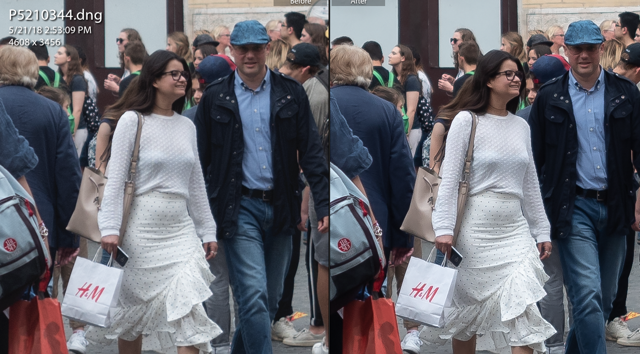
The different parts of the scene that are imaged onto the sensor can be a bit ill-defined, especially if we are using bad lenses that produce blurry images, or we are slightly out of focus producing blurry images, or there was too little light for the sensor producing blurry images, or whatever else happens to produce blurry images.  By adjusting the sharpness, we can create along the edges of elements in the image, increased micro-contrast that is perceived as sharpness.  Almost every image needs some of this, but not too much.  If you over-sharpen the image you will get a halo effect around things that is very annoying.  You can see the effects of sharpening in the comparison below.  But you have to look closely t the details of the woman's glasses, etc, at this scale.


Saturation - Saturation is best described as the intensity or depth of the colors in an image.  When we take landscape photos of the leaves on the mountains in the fall, for example, we are often disappointed that the camera did not capture the true colors as we remember them.  Part of the reason for this is that we remember them better than they actually looked, because we have brains that tell us things that are not true all the time.  But we still want our photos to represent the image in our heads.  Cranking up the saturation a little will help with that perception.  Here is a comparison:


Shooting in raw format - Raw format is the (mostly) unprocessed digital image file coming out of the camera.  It contains all the image information.  If you allow your camera to pre-process your images into compressed files (jpg, for example) it will do all sorts of things to them according to the people who programmed it.  If you shoot in raw mode, you have the freedom to make the adjustments yourself.  You can make additional adjustments to the jpg files, but your choices and controls are more limited.  However, most jpg files are just fine because the people who programmed your camera made sure of that.

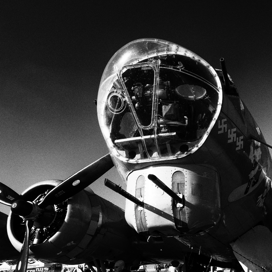
This is getting a bit long, so we will take up more topics related to post processing next time.  But before I close, take a look at the image at the top of the page.  I exposed the image to make the sky look good, knowing that the shadow areas would be too dark.  But I used some processing to bring out the shadow areas and get the best of both worlds.

Saturday, March 2, 2019

Creating a photo after you take the shot

I enjoy the post processing aspects of photography at least as much as taking the shots themselves.  For me, the creative process only starts in the camera, but becomes complete in post.  It's like a quote from Ansel Adams: "The negative is like the composer's score, and the print is the performance." 

In my photography world, the image in the camera is only the beginning of the process.  Here is an illustration.

This is a sort of street photo I took.


Clearly there are a lot of issues with this original shot.  First, it's very angled.  Second, the subject is in the center of the frame, with leading lines heading up to her neck sort of.  But that's ok, because I was just considering it to be the canvas that requires some additional work to make it into a photograph.

Step 1:  Straighten.

You don't always need to straighten a photo, but in this case it was necessary.  The process of getting the subject into a more or less vertical orientation also cleans up some of the extraneous stuff in the frame, such as the half-person on the right foreground.  So, here is the result of straightening.


I chose to crop vertically in portrait mode, because in my mind I see it as more pleasing.  I could have cropped horizontally and retained more of the background, but I think the background is distracting, so I got rid of it by cropping vertically.

You can see that everything in the background of this view is still tilted EXCEPT the subject.  Many times by cropping in like this, even if the background elements are angled, you won't notice.  Other times, you notice but you don't care.  This is almost one of those "don't care" situations. 

Almost, but not quite.  For me, my eye is still drawn to the paving stones and the people in the background, which takes away from the portrait of the girl.  So, I decided to crop some more.

Step 2: Crop in tight


Now we're talkin'.  Because I had the lens opened up we have a very shallow depth of field and you can see that the subject is much sharper than the background, making her stand out.  Plus, you can see a little rim light effect on the profile, which helps even more.  Furthermore, you can now see some stray hairs, etc., which add to the realism of the portrait.  And, now the jewelry is obvious. Finally, you see the expression in her eyes. Those touches create the photo, in my opinion.  The people in the background are still standing at an angle, but now they are so insignificant that you don't notice.  Your eye is drawn first to her eyes, and then to her jewelry.  And from a storytelling standpoint, you are wondering what she is looking at with her one eyebrow raised.

You will notice that she is not centered in the frame.  That is intentional.  I don't much care for symmetry in a photo unless I am intentionally shooting something symmetric.  In this case, she is staring into the distance, out of the frame to the right.  So I gave her a little space in the frame to emphasize that point.

I could have stopped at this point and been satisfied, and I kinda am.  But I always like to see what happens if I remove the color from a portrait.  Sometimes you get a wonderful surprise.  So I converted to black and white.


Some people don't appreciate black and white images as much as I do, and that's ok.  But I do like this image in black and white.  By removing all the color, I have also removed the remaining background distraction in the image, which was the red jackets and shirttails of the people back there.  In the B&W version, you actually have to look closely to even see the people.  They've almost completely been pushed into just abstract patterns, leaving us to focus on the expression of the girl.

And I think that's an improvement.

So, what have we done here?  We took a sort of random drive-by shot of a girl walking and turned it into a nice portrait, with a little mystery thrown in by emphasizing her expression through removing all other distractive elements.  We threw away the environmental context of the shot and picked up some emotion.  In this particular case, I think that's a fair tradeoff.